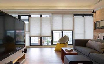
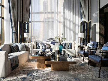
软装搭配-在不到60平米的房子内创造时尚生活
摘要:这个小型的公寓在布加勒斯特,罗马尼亚上个世纪80年代的建筑设计,是设计师Dana Kallo解决搬迁到爱尔兰之前最后一个项目。公寓拥有者选择它是因为它良好的地理位置而不是因为它的外观,因此非常需要改进与更新。
乐居生活带你一起寻找最美生活方式。如果你想看真实的装修经验谈,装修攻略,装修吐血总结,请关注乐居生活。这里真实记录了装修点点滴滴、酸甜苦辣的装修过程、装修技巧。
只有一间卧室的公寓摇身一变成了一个两房的家,全靠智能存储理念
A 1-bedroom apartment becomes a 2-bedroom family home full of smart storage ideas
这个小型的公寓在布加勒斯特,罗马尼亚上个世纪80年代的建筑设计,是设计师Dana Kallo解决搬迁到爱尔兰之前最后一个项目。公寓拥有者选择它是因为它良好的地理位置而不是因为它的外观,因此非常需要改进与更新。“我们想出了一个能够容纳年轻的家庭需要的所有功能的设计,这将具有丰富的存储功能和一个额外的卧室,”Kallo说。
The redesign of this compact apartment in a 1980s building in Bucharest, Romania, was the last project designer Dana Kallo tackled before relocating to Ireland. The owners had chosen it for its great location rather than its looks, and it badly needed updating and improving. “We came up with a design that would accommodate a young family in need of a functional home, with plenty of storage and an extra bedroom,” Kallo says

将这一个小的一室公寓巧妙地变成一间正在期待他们第一个孩子的年轻夫妇的两室公寓。客厅、厨房和餐厅改成是一个多功能的开放空间,而旧的厨房变成了一个小而舒适的卧室。“为了以后的孩子,我们试图让这件房间尽可能地保持整洁。”Kallo说,“所有的家具都是靠墙的,为的是在中间留有足够的自由空间。”
This small one-bedroom flat was cleverly converted into a two-bedroom home for a couple expecting their first child. The living room is now a multifunctional open space with a kitchen and dining area, while the old kitchen became a small but cozy bedroom. “With the baby in mind, we tried to keep this room as uncluttered as possible,” Kallo says. “So all the furniture was designed to go around the walls, leaving plenty of free space in the middle.”

装修前的图片 Before Photo
在装修之前:“这个公寓是二手的,所以这有可见的时间与使用过的痕迹”Kallo说,“因为它已经相对较旧了,电力与管道系统也要重置,配置也应该升级到满足一个现代家庭的需要”
BEFORE: “The apartment was lived in before the clients bought it, so it had visible marks of time and usage,” Kallo says. “As it was built so long ago, the electrical and plumbing systems had to be replaced and adapted to suit modern appliances and devices.”
这就是kallo和她的团队第一次看见的客厅现状。“硬木地板坏了,必须更换,所有的内部装饰必须更新”她说。
This is how the living room looked once Kallo and her team had gutted it. “The hardwood floor was also in very bad shape and had to be replaced, and in the end, all the interior finishes had to be renewed,” she says.

装修后的图片after photo
装修后:“一个最重要的措施是重新把客厅设计成一个开放的空间,包括一个组合沙发休息区、烹饪区和就餐区,”Kallo说。“总之,新的客厅成为公寓的焦点。”
AFTER: “One of the most significant interventions was redesigning the living room as an open space that includes a relaxation area with a generous sectional sofa, a cooking area and a dining area,” Kallo says. “In short, the new living room became the focal point of the apartment.”
沙发购于当地的零售商。“主要是考虑到沙发是L型的,创造了很多座位。这一特点也区分了客厅和餐厅。”她说。
The sofa came from a local retailer. “The main idea was that it was L-shaped, to create a lot of seating space and to zone the seating area, dividing it a little from the dining table,” she says.

另一个重要的改变是将旧厨房改造成一个有步入式更衣区的卧室。多彩的壁纸给空间带来了个性,而定制型镜子有助于提高空间亮度和空间感。
Another key change was to turn the old kitchen into a master bedroom with a walk-in dressing area. Colorful wallpaper brings personality to the space, while the long custom mirror helps boost light levels and the sense of space.
床边的管道依旧可以使用。“管道是白色的”Kallo说,“我们在想,我们不能隐藏它,但是我们能涂上明亮的颜色让它与整体相搭配起来。”
The pipes by the bed are still in service and had to remain. “They were white,” Kallo says. “We thought, ‘We can’t hide them, so let’s be playful with them and paint them a bright color.’”

第一个主要变化是移动老厨房和客厅之间运行的管道。“把它移动到隔墙里,”Kallo说,“我们很幸运,只需要移动接入点到管道里,保留了管道的原位置。如果我们不得不完全移动它们,这将需要大量的许可证,这将有复杂的工程。”
The first major change was to move the plumbing that ran between the old kitchen and living room. “It ran within that partition wall,” Kallo says. “We were lucky that we just had to move the access points to the pipework, but kept the pipes in the same position. If we had had to completely move them, it would have required a lot of permits and permission, and that would have complicated the project.”

下一步就是去创造一些额外的储存空间,主要是放置一些平时很少用到的东西,包括反季节的衣服和书籍。“主人房的床设计成高架的地板,为的是为主人提供更多的藏书空间”Kallo说,“床垫被直接放置在高架地板上,为的是扩增房间空间。”
The next step was to create the extra storage space needed for rarely used objects, including out-of-season clothes and books. “The master bed is designed to sit on a raised floor to create storage space for the owners’ vast collection of books,” Kallo says. “The bed mattress was placed directly on top of this raised floor to amplify the space in the room.”

主人房内的高架地板同时也提供了柜子的设计,在床的地下和床的周围。他们通过揭盖的方式打开,非常方便。
The raised floor in the master bedroom also has box spaces designed within it, under and around the bed. They are easily accessible by lifting their lids.

我们和当地的木匠合作,他们负责制造房子里大多数的家具,包括厨房设备、客厅设备、宝宝房间的衣柜和走廊储存柜。”Kallo说,“这些作品都是我们的设计,创造让每一个小角落发挥所有的能量。”
“We worked with a local carpenter who made most of the furniture around the house, including the kitchen units, the living room units, the wardrobe in the baby’s bedroom and the hallway storage,” Kallo says. “These pieces are all our designs, created so that every little corner would be used to its full potential.”
天花板上的投影仪与门旁边墙壁上的屏幕。“这是主人的一个特别要求,因为房间非常长,所以这个距离非常适合投影仪与屏幕,”她说。
A projector in the ceiling above the sofa works with a screen on the wall next to the door. “It was a special request from the owners, and because the room is rather long, there’s a good distance between the projector and screen, so it works,” she says.

在厨房,厨具与橱柜是组合在一起的,后挡板是由印刷玻璃制造而成的。“在近几年里,很多年轻的罗马尼亚夫妇已经回到了烹饪和在家做的传统菜肴的想法中,而不是出去吃的,”Kallo说。“所以给业主所有他们需要的厨具是非常重要的。” 他们应该要有一个烤箱,微波炉,一个全尺寸的水槽,一个罩和冰箱,灶具。
In the kitchen, the appliances were integrated, and the backsplash was created with a printed glass. “In the last few years, a lot of young Romanian couples have got back into the idea of cooking and making traditional dishes at home, rather than eating out,” Kallo says. “So it was very important to give the owners all the appliances they needed.” They have an oven, a microwave, a full-size sink, a cooktop with hood and a fridge-freezer.

装修前的照片Before photo
装修之前:这个原本在厨房旁边的阳台被转换成主卧室的步入式衣柜。
BEFORE: This balcony was next to the old kitchen before being converted into a walk-in wardrobe off the master bedroom.

装修之后:Kallo在前阳台安装一个开架式模块化存储结构,创造宽敞的步入式衣橱。“我们使用轻柔的白色窗帘来隐藏衣橱的结构和保护从大窗户进来的自然光。”
AFTER: Kallo installed an open-shelf modular storage structure to create the spacious walk-in wardrobe in the former balcony. “Instead of doors, we used airy white drapes to hide the structure and preserve the nice natural light that was coming into the room through the large windows of the balcony,” Kallo says.

在这里,你可以清楚地看到那些白色的窗帘轻轻隐藏的衣柜。
Here you can see clearly how the floaty white drapes softly conceal the wardrobe area.

相同的奶白色窗帘巧妙地掩盖床对面的书架。“我们增加一个可被用来当做小电脑桌或梳妆台的铰链台面,从而来改进的模块化架子系统,”Kallo说。
The same fluid white drapes subtly mask the bookshelves on the wall opposite the bed. “We improved the modular shelving system by adding a hinged worktop that can be used as a small laptop desk or a vanity table,” Kallo says.

这间公寓的额外房间是用来给以后的宝宝的。饱满的颜色,漂亮的墙纸以及一个大衣柜是房间的关键,这使得房间既好玩又有功能。最左边的沙发床是从业主之前的家搬来的,如今为了方便,摆放在婴儿床的隔壁。“我们很高兴,在设计这公寓的两年后,业主与我们取得联系,并且要求我们为第二个婴儿的到来再次准备这间房间!”Kallo说。
The apartment’s existing bedroom was redesigned for the owners’ baby. Bursts of color, pretty wallpaper by the crib and a large wardrobe are key elements that make the room both playful and functional. The sofa bed, at far left, was recycled from the owners’ former home and placed near the crib for convenience. “Recently, we were delighted that, two years after designing the apartment, the owners got in touch again asking us to prepare this room for the arrival of a second baby!” Kallo says.

浴室全面装修,如今它有一个新的浴缸、水槽、厕所、地板和瓷砖。“我们设计了一个大型的镜箱,客户可以储存从毛巾到化妆品的一切东西。”Kallo说。
Fully refurbished, the bathroom has a new tub, sink, toilet, floor and tile. “We designed a large mirrored cabinet where the clients store everything from towels to makeup,” Kallo says.

除了储物柜之外,沐浴墙有三个马赛克瓷砖壁龛,保证化妆品与洗护用品能触手可得。
In addition to this storage, the shower wall has three mosaic tile-covered alcoves where more toiletries can be kept within easy reach.

大量的存储空间被设计在走廊里。“所有的清洁产品,烫衣板,晾衣架,袋子和行李,冬天的衣服,和其他有用的小物品都被放到这里,”Kallo说。靠近浴室的的柜子是用来放洗衣机和烘干机的。
A lot of storage space was designed to go in the hallway. “All the cleaning products, ironing board, laundry rack, bags and luggage, winter clothes, and other useful small items for the house were brought in here,” Kallo says. The unit near the bathroom door at the far end accommodates the washing machine and dryer.
Kallo在房间里放置大量的镜子,为的是增加空间感以及隐藏一些储存柜。“在走廊的镜子是公寓内唯一一个全身镜,”她说。“在出去之前看一眼是有用的。”
Kallo worked mirrors into most of the rooms to help increase the sense of space and disguise some of the storage. “This one in the hallway is the only full-length mirror in the apartment,” she says. “It’s useful for a final look before you go out.”

装修之前的照片
在装修之前:这是以前挂满了自定义存储入口大厅。
BEFORE: This is the entrance hall before it was decked out with custom storage.

装修之后:现代化的公寓,更换了天然气和电,并使用定制化的内置柜,充分利用了空间且省钱。“然后,我们试图找到一些比较便宜的家具来填满空间,但是这些家具是业主日后能找到其他的家具来代替的。”Kallo说。
AFTER: Modernizing the apartment, replacing the gas and electrics, andgoing with custom built-ins to make best use of the space took up most of the budget. “We then tried to find inexpensive furniture that would complete the space, but which the owners could replace in the future for something bigger or better,” Kallo says.
“中赫时尚是一个很多元化的平台,当时选择软装设计课程的时候,除了可以和我的工作结合,更被其中多种课程模块吸引,来了之后发现还有好多的设计课程,比如花艺、橱窗等,这些我都很感兴趣,这些也将会成为今后空间软装设计的新趋势。”
图文自来中赫时尚
总公司ADD:北京市朝阳区酒仙桥北路7号电通创意广场5号楼c区
分公司ADD:广东省佛山市顺德区大良凤翔路创意产业园A座3013A室


标签:
热门资讯排行
- 资讯专区
- 图片专区
- 品牌专区


